Analytics in Python
Analytics in Python
Analytics In Python
SQL is often interleaved into python as part of an analysis pipeline or notebook; for fetching data, for cleaning data, for transforming data. There's plethora of 'sql on dataframes' options that speak to the enduring popularity of SQL as a data manipulation language. I confess to often finding pandas syntax for joins, merging, and managing dataframes to be a bit clunky.
DuckDB has a great python API, and it's a great way to run SQL queries against dataframes. Trilogy and DuckDB can work well together; let's take a look.
In this example, we'll:
- Install some packages
- Get some data you think is interesting in a dataframe
- Define a model for it
- Run queries against it in DuckDB
- iterate on the model and the queries
What are we doing?
Let's ay we want to analyze the relationship between health spending, life expectancy, sea ice extent, and the Dow Jones index.
Why? Who knows! Let's grab the example seaborne datasets, register those in duckdb, and go to town.
We know we need some data, and we know we want to plot it. Let's grab that and look at the data. We're going to use seaborn for plotting, and grab the example data from seaborn to make this easy.
We'll start out with some imports.
from trilogy import Dialects, parse
import seaborn as sns
import pandas as pd
import matplotlib.pyplot as plt

healthexp = sns.load_dataset("healthexp")
seaice = sns.load_dataset("seaice")
dowjones = sns.load_dataset("dowjones")

print(seaice.head(10))
print(dowjones.head(10))
print(healthexp.head(10))
Now we can create a model. You can directly build this in the python API, but just parsing trilogy can be more concise. We'll cover a pure-python example later.
Tips
Remember - you can move the model to a file and load it in the python API if you want to keep your code clean. You can also start with your model before you even have the data, as spec for what you want in the end!
env, _ = parse(
"""
key year int;

key date date;

key country string;
property <year,country>.spending_usd float;
property <year,country>.life_expectency float;

# ice is by day
property date.sea_ice_extent float;

# stock price by day
property date.dow_jones_price float;
""")
DuckDB integration
Our model is ready, but we need to feed it some data. We can do that by creating a duckdb executor and registering the dataframes we created earlier.
# set up the executor
executor = Dialects.DUCK_DB.default_executor(environment=env)

# register our dataframes with duckdb
#it should do this implicitly, but a recent version had bugs, so let's be explicit for safe
executor.execute_raw_sql("register(:name, :df)", {"name": "healthexp", "df": healthexp})
executor.execute_raw_sql("register(:name, :df)", {"name": "dowjones", "df": dowjones})
executor.execute_raw_sql("register(:name, :df)", {"name": "seaices", "df": seaice})

# bind our datasers
env.parse('''

datasource healthexp (
    # we don't think we have every year here, so we'll mark year partial
    Year:~year,
    Country:country,
    Spending_USD:spending_usd,
    Life_Expectancy:life_expectency
)
grain (year, country)
address healthexp;

datasource seaices (
    # also don't have all dates yere
    Date:~date,
    # we can bind year by transforming the date we just assigned
    year(date): ~year,
    Extent:sea_ice_extent
)
grain (date)
address seaices;

datasource dowjones (
    Date:~date,
    year(date): ~year,
    Price:dow_jones_price
)
grain(date)
address dowjones;

# and to provide a base, let's create a list of all our years
datasource years (
    year:year)
grain (year)
query '''
SELECT generate_series as year
FROM generate_series(1900, 2020)
''';)
Executing the analysis.
Now, we can get down to business. Let's write a query to grab our spending by year, our spending for the USA by year, avg life expectency, max sea ice, and max dow jones.
Our trilogy will be pretty straightforward here:
select
    year,
    sum(spending_usd) -> total_yearly_spending,
    sum(spending_usd ? country = 'USA') -> total_yearly_spending_us,
    avg(life_expectency) -> avg_life_expectency,
    max(sea_ice_extent) -> max_sea_ice_extent,
    max(dow_jones_price) -> max_dow_jones_price
order by
    year asc
;
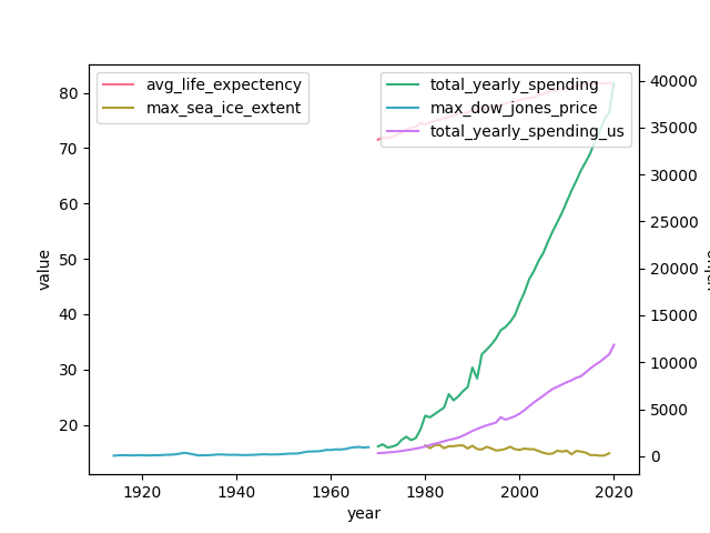
But we'll have to do some manipulation to get it plotted. Sea ice coverage has to be between 0 and 100, and life expectancy probably unfortunately also is...
def render_fig():
    results = executor.execute_text("""
select
    year,
    sum(spending_usd) -> total_yearly_spending,
    sum(spending_usd ? country = 'USA') -> total_yearly_spending_us,
    avg(life_expectency) -> avg_life_expectency,
    max(sea_ice_extent) -> max_sea_ice_extent,
    max(dow_jones_price) -> max_dow_jones_price
order by
    year asc
;
    """)
    df = pd.DataFrame.from_records(results[-1], columns=results[-1].keys())
    palette = sns.color_palette("husl", 5)
    fig, ax1 = plt.subplots()
    scale_1 = df[['year', 'avg_life_expectency', 'max_sea_ice_extent', ]]
    scale_1_melt = pd.melt(scale_1, ['year'])

    scale_2 = df[['year', 'total_yearly_spending','max_dow_jones_price', 'total_yearly_spending_us']]
    scale_2_melt = pd.melt(scale_2, ['year'])

    plts = sns.lineplot(data= scale_1_melt, x= 'year', y='value', hue='variable', palette=palette[:2], ax=ax1)
    ax2 = plts.twinx()

    sns.lineplot(data= scale_2_melt, x= 'year', y='value', hue='variable', ax =ax2, palette=palette[2:])
    ax1.legend(loc='upper left', bbox_to_anchor=(0, 1))
    ax2.legend(loc='upper right', bbox_to_anchor=(1, 1))
    plt.show()
    plt.clf()

render_fig()

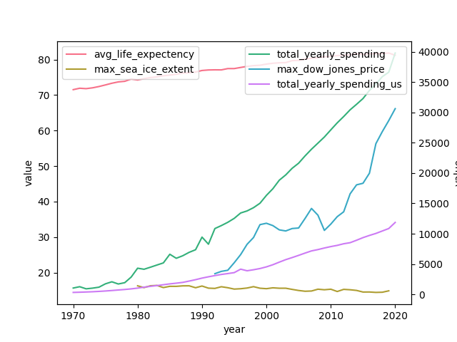
Not bad. But the Dow Jones info is badly out of date compared to the other data. Let's update that.
Yahoo finance has a convenient API. We can pull down a new dataframe and register it in duckdb.
import yfinance as yf

# Define the Dow Jones Industrial Average symbol
ticker = "^DJI"

# Download the last 100 years of data (from 1924 to now)
yahoo_dji = yf.download(ticker, start="1900-01-01", end="2024-01-01")
# reset the date
yahoo_dji = yahoo_dji.reset_index()
# Preview the data
print(yahoo_dji.head(10))

executor.execute_raw_sql("register(:name, :df)", {"name": "dowjones2", "df": yahoo_dji})
Now how to get it into our model? We have a few options here. We could add a new concept and new datasource, and update our queries to reference this (maybe coalesce old and new? Or plot next to each other?). This would be standard for updating a model that's in use by others, to enable side by side comparison before eventual migration.
Or we could just purge our last binding, and rebind the old concept to a new datasource so we don't have to update our queries at all.
Let's do that!
# delete the datasource we created
del env.datasources['dowjones']
# add a new one
env.parse(
"""

datasource dowjones2 (
    Date:~date,
    year(date): ~year,
    Close:dow_jones_price
)
grain(date)
address dowjones2;

"""
)
We're ready to go. Let's just rerun the render_fig function we created.
render_fig()

That's it. Our queries haven't needed to change at all.
Takeaways
Trilogy serves the same role in exploratory analysis as SQL - it can be used for fetching data [we'll cover that in the future] and transformations.
So why use it?
The model definition provides a durable contract that you can use to promote the analysis into something 'product ready' in the future, and a blueprint for what you want to get. As we've seen, you can keep the same logical structure and update your datasources and move them around with low friction.
Tips
Ultimately, interactive analytics are a deeply personal workflow - experiment and find if something works for you!
